Sidecar Health | 2022
Care Search
Sidecar Health is a health insurance start-up that allows their members to be in the driving seat by giving them complete control of who they can see and how much they should pay. This project was focused on improving the search experience for finding different types of care and estimate how much they will pay out of pocket.
My Role
I led the user research for this project as the lead designer and worked closely with the product manager to come up with a product strategy.

User Research
30 minute virtual interviews with 11 existing members to understand how and when they use the Estimate Care pages on our app.
Overall Finding
Users are using Estimate Care in preparation of visiting a provider to:
Estimate how much they will pay
Look for a provider in their area
Pain Points
Hard to know which Sidecar Codes are the right Care users are looking for
Users have very little confidence about the amount they will end up paying
There isn’t enough information about providers
It’s hard to prepare for large procedures
Product Strategy
Through the research we identified 4 areas of improvement:
How might we make it easier for our users to know which care services are the right Care they are looking for
How might we increase user confidence in knowing how much they will end up paying
How might we provide users with more up to date provider information
How might we help users prepare for large complex procedures that consist of multiple services
This greatly influenced the area of focus and shaped the roadmap for the upcoming year. For example, the team began reaching out to potential vendors for 3rd party provider data and finding ways to bundle complex procedures into one listing so the users don’t have to browse the services individually.
Web Experience
Pain points
Solution
Additional improvements
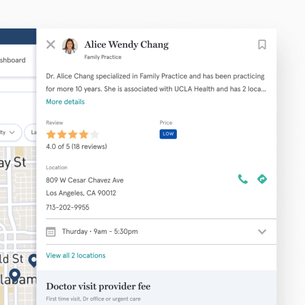
Quick view
A quick view drawer to view provider details and contact information without leaving the page.
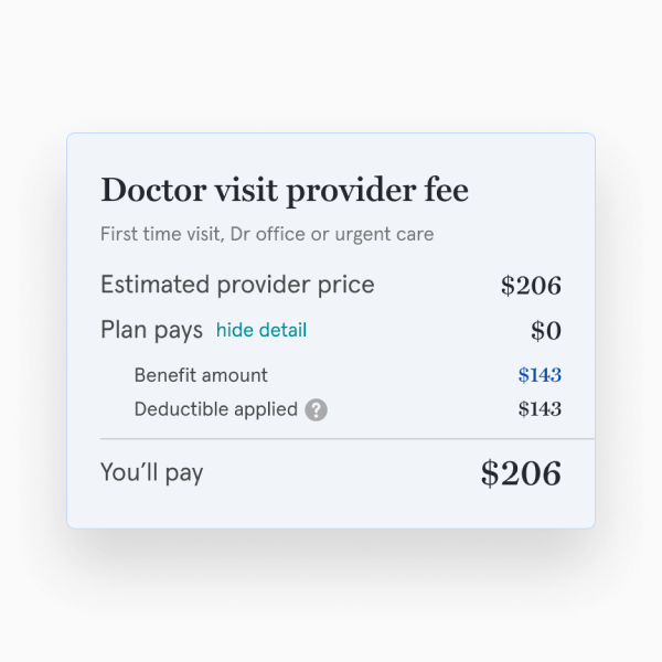
Coverage Summary
A price breakdown of how much the provider is charging along with the plan coverage to understand how much the member will end up paying.
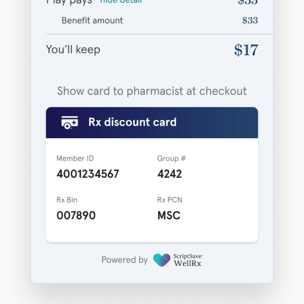
Pharmacy Discount
The pharmacy discount card is prominently displayed next to the prescription prices so users can have easy access to the card when they are paying for their prescription.
App Highlights
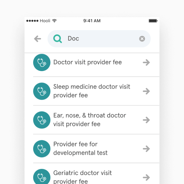
The mobile app was handled differently to follow native patterns and improve app performance.
Optimized for Apps
Simplified page elements to reduce page load and improve performance. For example, removing the search bar from all pages decreased file size and decreased load time.
Native Components
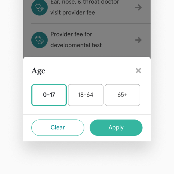
Replaced modals with sheets for easier reach.
Immersive Experience
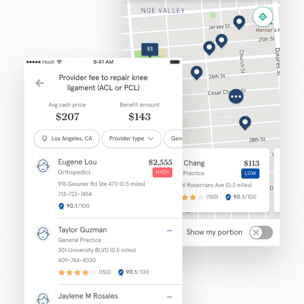
A full page provider search to provide an focused search experience with plenty of real estate to display the information users need to choose the right provider.

